Introduction
In the first part of this article I focused on MVVM and its impact on how to write Xaml code. In this second part I’ll focus more on pure Xaml code and what makes it so powerful.
If you didn’t read the first part you can start here
Bindings
Well I guess bindings is a well known part of Xaml/MVVM so I will go through the basics quicly.
Binding to the viewmodel
The most used binding is the one that ties a viewmodel property to a view element property:
<TextBox x:Name="Title"
         Text="{Binding Title}"
         />
Binding to a view element
This is quite basic too but you can tie a view element property to another view element property:
<!-- Bind to a parent element selected by its type -->
<CheckBox x:Name="SelectionState"
          IsChecked="{Binding IsSelected, RelativeSource={RelativeSource AncestorType=ListViewItem}}"
          />

<!-- Bind to a named element present in the same visual tree -->
<CheckBox x:Name="MyCheckBox"
          />
<Expander x:Name="Section"
          IsExpanded="{Binding IsChecked, ElementName=MyCheckbox}"
          />

<!-- Bind an element property to another property of the same element -->
<MenuItem x:Name="Option"
          Visibility="{Binding IsEnabled, RelativeSource={RelativeSource Self}, Mode=OneWay, Converter={StaticResource BooleanToVisibilityConverter}}"
          />
Mode
Am I the only one that can’t remember how “OneWay” and “OneWayToSource” works? So here is a reminder (maybe only for myself):
- OneWay: the viewmodel will update the view but not the opposite
- OneWayToSource: the view will update the viewmodel but not the opposite
Converters
Converters are a great way to transform your data into something that can be displayed. But they should be used sparingly.
Why?
Because transforming your data for presentation is exactly the responsibility of the view model. Indeed you probably often hesitate between doing the conversion in the viewmodel or in a converter.
When?
I don’t have a deterministic way to decide, but here are a few tips that can help to choose how to convert your data:
Use Converter
- Convert data to UI specific info (Visibility, Opacity, ImageSource, Color, DataTemplate …)
- When you need the same conversion across many different viewmodels/views
Use Viewmodel
- String conversion (unless it can be shared across many views)
- When you just want to combine other properties from your viewmodel For the completeness of this section here is a simple converter that also use the parameter to convert an enum value into a boolean value. This converter can be used for a flag enum property that could be bound to a checkbox for exemple.
For simplicity I have added an enum here, but indeed it doesn’t makes sense in production code !
[Flags]
public Enum Options
{
  None=0x0,
  First=0x1,
  Second=0x2,
  Third=0x3,
}

[ValueConversion(typeof(Enum), typeof(bool))]
public class EnumFlagToBooleanConverter : IValueConverter
{
  public object Convert(object value, Type targetType, object parameter, CultureInfo culture)
  {
    return ((Enum)value).HasFlag((Enum)parameter);
  }

  public object ConvertBack(object value, Type targetType, object parameter, CultureInfo culture)
  {
    return (bool)value ? parameter : Binding.DoNothing;
  }
}
And here is how you could use such a converter with a parameter:
<CheckBox x:Name="HasFirstOption"
          IsChecked="{Binding MyEnumFlags, Converter={StaticResource EnumFlagToBooleanConverter}, ConverterParameter={x:Static Options.First}}"
          />
<CheckBox x:Name="HasSecondOption"
          IsChecked="{Binding MyEnumFlags, Converter={StaticResource EnumFlagToBooleanConverter}, ConverterParameter={x:Static Options.Second}}"
          />
<CheckBox x:Name="HasThirdOption"
          IsChecked="{Binding MyEnumFlags, Converter={StaticResource EnumFlagToBooleanConverter}, ConverterParameter={x:Static Options.Third}}"
          />
Styles
In the context of a business/public application you cannot go without styles! Style is to WPF what css is to HTML. That’s the best way to define your application’s look’n feel. Basically a style is a set of visual properties relative to a control type that can be reused as many times as you want.
Basic sample
<Style x:Key="SpecialPurposeButtonStyle" TargetType="{x:Type Button}">
  <Setter Property="FontSize" Value="11" />
  <Setter Property="FontWeight" Value="Bold" />
  <Setter Property="MinWidth" Value="80" />
  <Setter Property="BorderBrush" Value="Gray" />
  <Setter Property="BorderThickness" Value="1" />
</Style>
Well this is a very simple (not so useful) style that you can apply to any button instance the following way:
<Button x:Name="SpecialButton"
        Style="{StaticResource SpecialPurposeButtonStyle}"
        />
StaticResource
Though using styles this way brings value we are far from its full power! Indeed like in “code”, magic numbers and magic strings are not welcome in Xaml (IMHO). To avoid them you can use “StaticResource” the following way:
<system:Double x:Key="DefaultFontSize">15</system:Double>
<SolidColorBrush x:Key="SpecialOutlineColorBrush" Color="Red" />

<Style x:Key="SpecialPurposeButtonStyle" TargetType="{x:Type Button}">
  <Setter Property="FontSize" Value="{StaticResource DefaultFontSize}" />
  <Setter Property="FontWeight" Value="Bold" />
  <Setter Property="MinWidth" Value="80" />
  <Setter Property="BorderBrush" Value="{StaticResource SpecialOutlineColorBrush}" />
  <Setter Property="BorderThickness" Value="1" />
</Style>
You will notice that I didn’t replaced all “hard coded” values because not all of them needs to be shared across several styles. Yes, the main benefit of using “StaticResource” is to share the same resource across many styles. In my team we try to avoid hard coded colors and instead pick one of the defined colors in our graphical charter using StaticResource.
Now that you can share your styles across all your application there is another useful feature that you should be aware of. You can redefine the look’n feel of any control the following way:
<Style TargetType="{x:Type Button}">
  <Setter Property="FontSize" Value="{StaticResource DefaultFontSize}" />
  <Setter Property="FontWeight" Value="Bold" />
  <Setter Property="MinWidth" Value="80" />
  <Setter Property="BorderBrush" Value="{StaticResource DefaultOutlineColorBrush}" />
  <Setter Property="BorderThickness" Value="1" />
</Style>
With such an implicit style defined (notice that there is no “x:Key” specified) every button will have this style applied except if you specify explicitly a different style.
One final tip about style is inheritance, like we know it for C#. Let’s say you have defined an implicit style for all buttons like we just did in the snippet above. WPF allows you to create a new style based on an existing one:
Default control style
- The first style omits the x:Key which means it wil be applied to every Button except for buttons which have a specific style assigned.
- The second style defines a new style based on the default button style.
- The third one defines a style based this time on another “named” style.
<Style TargetType="{x:Type Button}">
  <Setter Property="MinWidth" Value="80" />
  <Setter Property="Template" Value="{StaticResource StandardButtonTemplate}" />
  <Setter Property="BorderThickness" Value="1" />
</Style>

<Style x:Key="SpecialPurposeButtonStyle" TargetType="{x:Type Button}" BasedOn="{StaticResource {x:Type Button}}">
  <Setter Property="BorderBrush" Value="{StaticResource SpecialOutlineColorBrush}" />
</Style>

<Style x:Key="SuperSpecialPurposeButtonStyle" TargetType="{x:Type Button}" BasedOn={StaticResource SpecialPurposeButtonStyle}>
  <Setter Property="Background" Value="{StaticResource SuperSpecialBackgroundColorBrush}" />
</Style>
Theme assembly
A good practice we have setup is to create an assembly dedicated to styles which we could call a Theme assembly. This assembly can contain resource dictionaries that defines default style for each control type. Here is what the structure looks like:
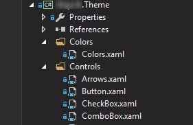
To maintain a good color consistency across the application and to ease color design adjustments we have grouped (almost) all our color definitions into one single xaml resource dictionary (let’s call it colors.xaml):
<Color x:Key="DarkColor">#1d1d20</Color>
<Color x:Key="LightColor">#353535</Color>
<Color x:Key="OverColor">#2A4B5F</Color>
<Color x:Key="SelectedColor">#286A8D</Color>
<Color x:Key="HighLightColor">#286A8D</Color>

<Color x:Key="DefaultTextColor">#E5E5E5</Color>
<Color x:Key="DarkTextColor">#AAAAAA</Color>
<Color x:Key="ErrorTextColor">Red</Color>
<Color x:Key="ErrorColor">#C12C28</Color>

<SolidColorBrush x:Key="DarkColorBrush" Color="{StaticResource DarkColor}" />
<SolidColorBrush x:Key="LightColorBrush" Color="{StaticResource LightColor}" />
<SolidColorBrush x:Key="OverColorBrush" Color="{StaticResource OverColor}" />
<SolidColorBrush x:Key="SelectedColorBrush" Color="{StaticResource SelectedColor}" />
<SolidColorBrush x:Key="HighLightColorBrush" Color="{StaticResource HighLightColor}" />

<SolidColorBrush x:Key="DefaultTextColorBrush" Color="{StaticResource DefaultTextColor}" />
<SolidColorBrush x:Key="DarkTextColorBrush" Color="{StaticResource DarkTextColor}" />
<SolidColorBrush x:Key="ErrorTextBackground" Color="{StaticResource ErrorTextColor}" />
<SolidColorBrush x:Key="ErrorColorBrush" Color="{StaticResource ErrorColor}" />
And in this same assembly you should put an additional resource file (let’s call it theme.xaml) with the following content (this is an exemple):
<ResourceDictionary
  xmlns="http://schemas.microsoft.com/winfx/2006/xaml/presentation"
  xmlns:x="http://schemas.microsoft.com/winfx/2006/xaml"
  >

  <!--
    Dummy style to prevent dictionary optimization.
    This flags the dictionary as containing default styles.
  -->
  <Style TargetType="{x:Type Viewport3D}" />

  <ResourceDictionary.MergedDictionaries>
    <ResourceDictionary Source="Colors/Colors.xaml" />
    <ResourceDictionary Source="Controls/Button.xaml" />
    <ResourceDictionary Source="Controls/TextBlock.xaml" />
    <ResourceDictionary Source="Controls/TextBox.xaml" />
    <ResourceDictionary Source="Controls/CheckBox.xaml" />
    <ResourceDictionary Source="Controls/ComboBox.xaml" />
    <ResourceDictionary Source="Controls/Expander.xaml" />
    <ResourceDictionary Source="Controls/ProgressBar.xaml" />
    <ResourceDictionary Source="Controls/RadioButton.xaml" />
    <ResourceDictionary Source="Controls/ScrollBar.xaml" />
    <ResourceDictionary Source="Controls/Slider.xaml" />
    <ResourceDictionary Source="Controls/TabItem.xaml" />
    <ResourceDictionary Source="Controls/ToggleButton.xaml" />
  </ResourceDictionary.MergedDictionaries>

</ResourceDictionary>
Thanks to this single theme.xaml file you can use easily include all resource dictionaries in your application this way:
<Application.Resources>
  <ResourceDictionary>
    <ResourceDictionary.MergedDictionaries>
      <ResourceDictionary Source="pack://application:,,,/Theme-assembly-name;component/theme.xaml" />
    </ResourceDictionary.MergedDictionaries>
  </ResourceDictionary>
</Application.Resources>
Sadly it will work at runtime but not in Visual Studio Xaml designer !